

| Table of Contents | ||||
|---|---|---|---|---|
|
Legal Notes
Copyright 2022 by TECHNIA AB
All rights reserved.
PROPRIETARY RIGHTS NOTICE
This documentation is proprietary property of TECHNIA AB. In accordance with the terms and conditions of the Software License Agreement between the Customer and TECHNIA AB, the Customer is allowed to print as many copies as necessary of documentation copyrighted by TECHNIA relating to the software being used. This documentation shall be treated as confidential information and should be used only by employees or contractors with the Customer in accordance with the Agreement.
Preface
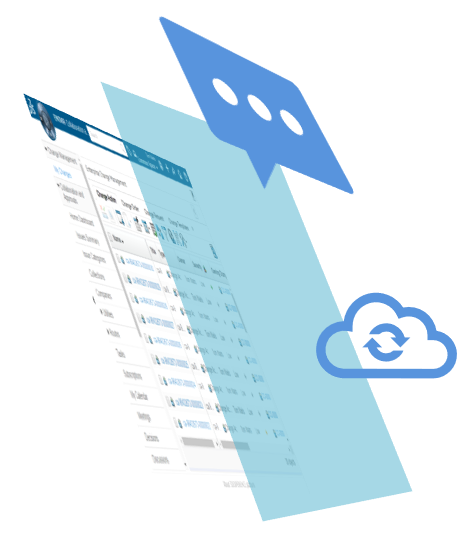
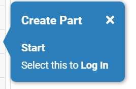
Light My Way is the Digital Adoption Solution (DAS) for the 3DEXPERIENCE platform. With the ambition to be recognized internationally as the best way to train and support your users on the 3DEXPERIENCE platform.
Digital Adoption Solutions (DAS)
Enterprise platforms (and the business processes it governs) are often complex and hard to learn. Traditional training methods & support is inefficient and costly. On top of that traditional methods causes user productivity loss and frustration.
DAS boost user productivity and adoption while avoiding cost related to excessive and inefficient training or support by providing guidance directly in-app. A good business case with a quick ROI is often easy create and there are general reports available from Gartner, Forrester etc to back it up.
Digital Adoption (DAS) for 3DEXPERIENCE
Light My Way is the only DAS product with 3DEXPERIENCE platform configurations built in. The platform configurations are owned and maintained as supported product by TECHNIA (there will be fixes and improvement over time and there is a dedicated support team).
The built-in, high quality and rich target platform configurations (delivered as a cloud service/SaaS) makes guide recording easy (point & click, no dev needed), setup is done within a minute and the resulting in-app user guides will deliver just-in-time off the shelf. On top of that no extra configuration work required over time as new areas are covered or the platform upgrades etc.
3DEXPERIENCE in-app user training
The right instruction at the right time
App state Context sensitive
Complex / dynamic processes supported
3DEXPERIENCE in-app training creation
Create instruction by point and click
Relate instructions to app state context (object type, UI components etc)
Best practices built in
Up and running with 3DEXPERIENCE in a minute!
Cloud subscription (no infra structure required)
No server deployment or dependency to normal release cycle (cloud target environments also supported)
No service required (pure software deal / instant value)

Light My Way is a generic software that works with all html based applications, as long as the right configurations is in place (described in the administration chapter).
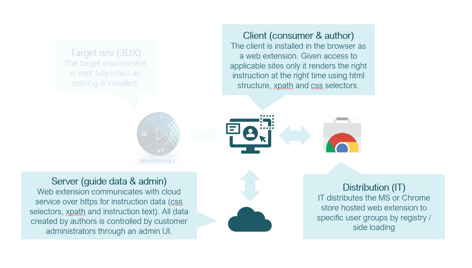
The software is installed client side in the browser as a web extension providing visual guidance and user training directly in-app. To display the right instruction at the right time each instruction is tied to application state using html identifiers such as ‘xpath' & 'css selectors’. New instructions are recorded through the web extension, data is stored and retrieved in an external service hosted by TECHNIA and made available by subscription.
Supported Platforms
3DEXPERIENCE
3DSPACE
3DDASHBAORD
Value Components
TVC
Helium
Configurations making the Consumer and Author roles work well are built in for the supported platforms. No project specific administration required to get started recording standard use cases using a rich set of built-in and supported conditions contexts and configs.
Platform maturity levels
| Info |
|---|
A more detailed list of all supported targets, conditions contexts and other built-in platform configurations can be shared on request. |
| Include Page | ||||
|---|---|---|---|---|
|
Roles
Light My Way supports 3 different roles or types of users. The ‘User guide’ covers the Consumer and Author roles while the ‘Administration guide’ covers the Administrator role.
  |   |   |
Consumer | Author | Administrator |
Web Extension | Web Extension | Admin UI |
Needs guidance using a web application (user, engineer or similar) | Knows how to use a web application (technical trainer, support or similar)* | Knows HTML/XPATH/CSS (developer / system administration) |
|
|
|
  |   |   |
* does not necessarily need html, css, xpath skills but should have strong enough logical reasoning skills to use built in visibility rules to control when instructions should show in complex flows etc
System Requirements
Client
Supported browsers
Chrome
Microsoft Edge
If there is a need for Light My Way on any other browser, contact us, we are happy to add it.
Server
The server is hosted as a cloud service and made available to customers as part of the subscription.
For special cases the server can be installed in private networks or external servers. The server is based on https://nodejs.org and nodejs system requirements applies.
Installation
The web extension architecture allows to provide user guidance without dependency to normal release cycles. No access to the server of the target application is required and guides recorded and distributed for CLOUD hosted target platforms is supported. Light My Way has no footprint on the target server application whatsoever and no server-side deployment is required.

Security
Data stored in server repository
Data classification: Internal
Documentation / guides recorded by customer ( ‘click here’ + html identifier)
Configurations to recognize 3DEXPERIENCE UI (css / xpath selectors)
Subscription audit detail (3DEXPERIENCE user id’s, last use dates etc)
No scripts, SQL or executable entries are stores in the data
Access control
User: JWT token (registry to request header)
Author: JWT token (registry to request header) + Passkey
Admin: Passport (username / password)
Web Extension (Client)
Integrity: reviewed, approved, hosted and secured by chrome store
Quality assured, scanned and tested before all (releases)
Does not load or evaluate any scripts dynamically (css/xpath and safe rich text format)
Manifest Permissions: storage, webNavigation, unlimitedStorage, contextMenus
Tools
Vulnerability scans (dependency track) executed and acted on continuously
Controlled build chain (jenkins)
Controlled deploy (terraform, docker)
Traceability / audit
History of configuration changes in admin UI
Protocol
SSL/HTTPS
ISO 27001 (information security)
Certified and audited on a yearly basis. We are continuously following up and mitigating security risk and have a security mindset in everything we do.
Client Installation
The client extension is one and the same for consumers and authors, it includes the default part used for consuming guides and by enabling author mode from the extension popup, the user can start creating guides after also providing an author key.
For web extension side loading by registry, the ExtensionSettings policy is used. For detailed understanding, please refer https://docs.microsoft.com/en-us/deployedge/microsoft-edge-manage-extensions-ref-guide and https://docs.google.com/document/d/1pT0ZSbGdrbGvuCsVD2jjxrw-GVz-80rMS2dgkkquhTY/edit#!
Specific site limitations
Restricting the extension access to the sites it is intended for is good practice. This so that the panel tabs or evaluation is excluded on all other sites. Site access is controlled using the runtime_allowed_hosts registry entry.
Example
| Code Block | ||
|---|---|---|
| ||
"runtime_allowed_hosts"="[\"https://lmw.technia.cloud\",\"://example.com\",\"://*.3ds.com\"]" |
| Note |
|---|
If limiting to specific sites, the data service host https://lmw.technia.cloud must be included for Light My Way server communication to work |
Access Token (Authentication)
To lock down access to the guide data a token can be generated with your account. If activated the token will be required to gain access to guide data.
As of this release the Light My Way team will generate the access token for you.
Access Token - Renewal
For increased security the access token can be renewed on a regular basis, but note that you would also have to deploy a new token to all clients.
The current access token will automatically become outdated as a new token is generated.
Access Token - Distribution
Distribution of the access token to clients is done by managed storage in registry. This means that the same distribution method is used for the access token as for the extension itself. Read more about managed storage here:https://developer.chrome.com/docs/extensions/mv3/manifest/storage/.
A managed storage key is only accessible by the extension itself (and those with access to read the registry). The token is added to and passed to the data service call with encrypted request headers.
Note that the proper manifest an managed storage schema configuration is already included with the product and you do not have to bother about that. An example of how to distribute the access token is included with the sample reg file in below chapter.
See below for more properties and settings that can be added to managed storage.
Managed storage keys
Key | Type | Description | Default value | Accepted values | ||
|---|---|---|---|---|---|---|
|
| Used to automatically authentication the extension to your account. |
| Access token provided by LMW team. | ||
|
| Used to prefill the account part of the server settings. |
| Your account name (usually company name). E.g. | ||
|
| Used to prefill the host part of the server settings. |
| Full URL to LMW server. | ||
|
| Used to prefill the repository part of the server settings. |
| Your repository name (usually company name). E.g. | ||
| ||||||
|
| Used to toggle if the user should be able to edit the server settings. |
|
| ||
|
| Used to toggle if the extensions author panel should be visible. |
|
| ||
|
| Used to connect the extension to self-hosted data file. |
| Full URL to data file. E.g. | ||
|
| Used to force all values in the registry entry to be replaced by the content of the registry file. |
|
E.g. | ||
Registry entries using file
Registry entries could be defined using file. Such a file is simply a text file with the .reg extension that will add registry entries when executed.
| Tip |
|---|
Sample registry files are available at https://products.technia.com |
Installing registry entries using file
Users can double click a .reg file to add the registry entries.
For large scale distribution, Group Policy Preferences(GPP) allows the administrator to easily import a .reg file into Group Policy with several registry settings.
Uninstalling registry entries using file
Added entries can be removed at any time using the same import method on modified .reg files by adding hyphen(-) before every value. Example:- "installation_mode"=-"normal_installed"
| Info |
|---|
For further information on REG files, please refer https://support.microsoft.com/en-us/topic/how-to-add-modify-or-delete-registry-subkeys-and-values-by-using-a-reg-file-9c7f37cf-a5e9-e1cd-c4fa-2a26218a1a23 |
Connecting to the data service
| Tip |
|---|
To use the by admin pre-configured server mapping just leave this field empty. You will connect to the data service mapped and intended for your current web page URL automatically. |
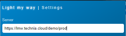
Connecting unmapped data service
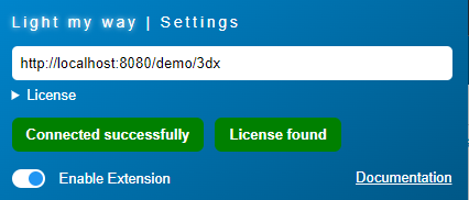
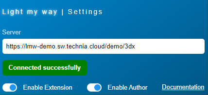
It is possible to connect with unmapped server repositories using the Server field in the web extension menu found at the top right of your browser. This could be useful for authors connecting to sandbox guide repositories etc that should not be used by the overall user community.
Click the extensions menu
Click “Light My Way“ icon
Enter server URL with domains and press ENTER
“Connected successfully” should appear in green
Server Installation
The normal setup is that TECHNIA will host the data service in the CLOUD and all you have to do is to connect to the account you get with your subscription.
On-prem hybrid
There are cases when cloud for different reasons is not feasible. For such cases we recommend a hybrid approach where guide creation and testing takes place in the cloud on a non sensitive data dev env. Once ready for production deploy the guide data is exported and the extension is downloaded for on-prem hosting. This solution require some minimal effort and the TECHNIA team can do the heavy lifting upgrading and migrating unsensitive guide data on the cloud.
On-prem
For special cases the server full stack can be installed in private networks or external servers. The server is based on https://nodejs.org and nodejs system requirements applies, DB is postgresql, cache redis etc.
Full on-prem is not recommended, as there is a larger effort related to setup, maintaining and migrating data or even adding components as the product microservice architecture evolves: Consider on-prem hybrid setup!
Need special agreement and support!
The Web Extension
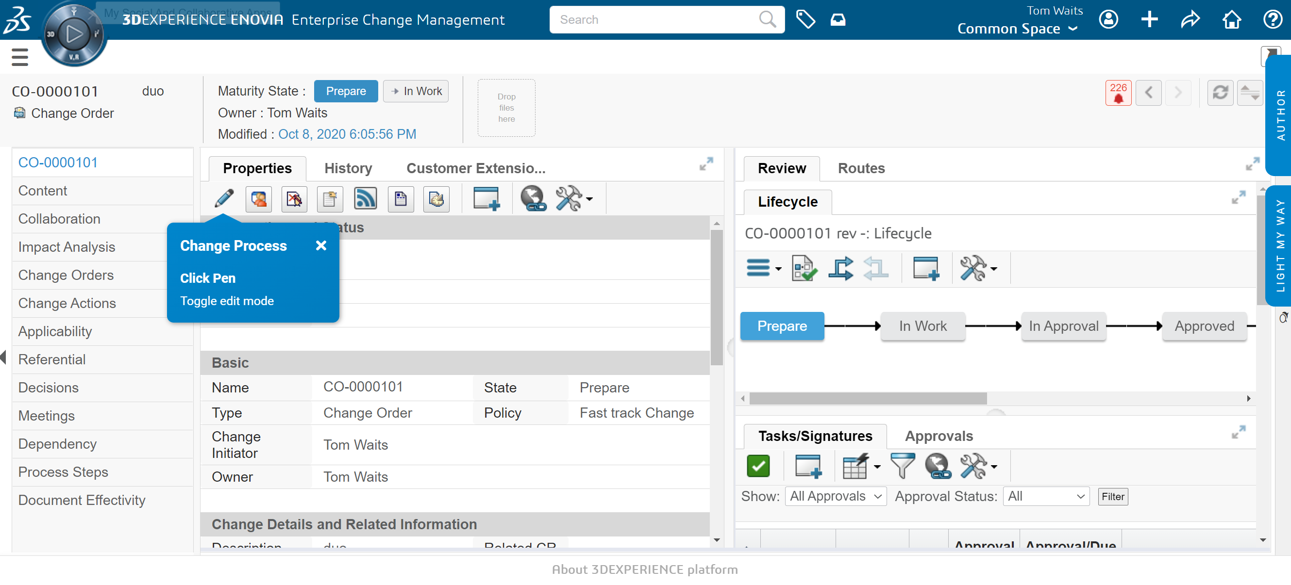
The Light My Way browser extension UI layer is added to the right side in the target application. Depending on role one or two tabs will be visible. The tabs are rendered on top and will not interfere with the UI. If the tabs for some reason are in the way you can move them by drag and drop. Clicking a tab will expand and display its content so that you can access its features. By clicking the tab again it will collapse to its original state.

Quick disable
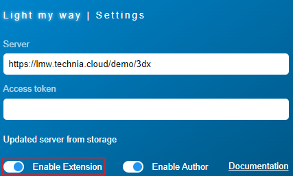
If you for some reason want to disable all Light My Way evaluation and rendering there is a quick enable slider available in the web extension menu found at the top right of your browser.
Enabling Author
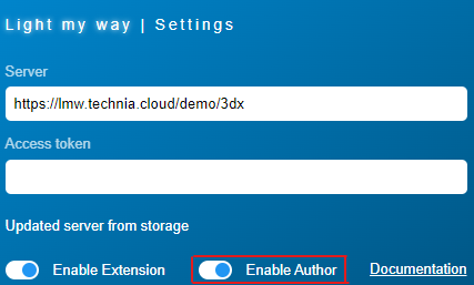
In the web extension popup you can enable or disable the author mode, using the author mode requires that you also provide the secret author key.
Toggle panel
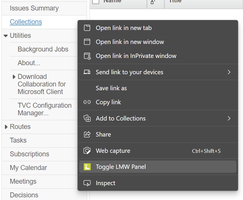
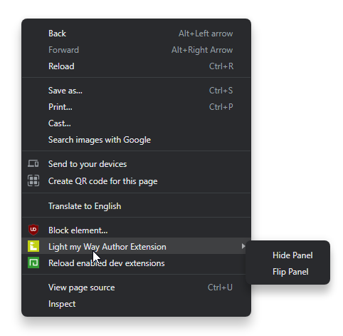
It is possible to toggle panel tabs to hide or show depending on preference. Toggle is available in the context menu accessed by right clicking somewhere in the target application. Toggle panel could be useful in case the panel is in the way or if you have set your preferred guides and you are only interested in the callouts.

Reposition
The user can move the panel tabs vertically. Reposition could be useful in case the tabs is in the way. Click and hold the tab and drag it up or down to reposition the tabs.
The new position is persisted so that the user preference is stored over sessions and the user do not have to repeat it.

Resize
The user can resize the panel by dragging on the resize button in the bottom left corner.
To reset the size simply click on the reset button next to it.

The Consumer
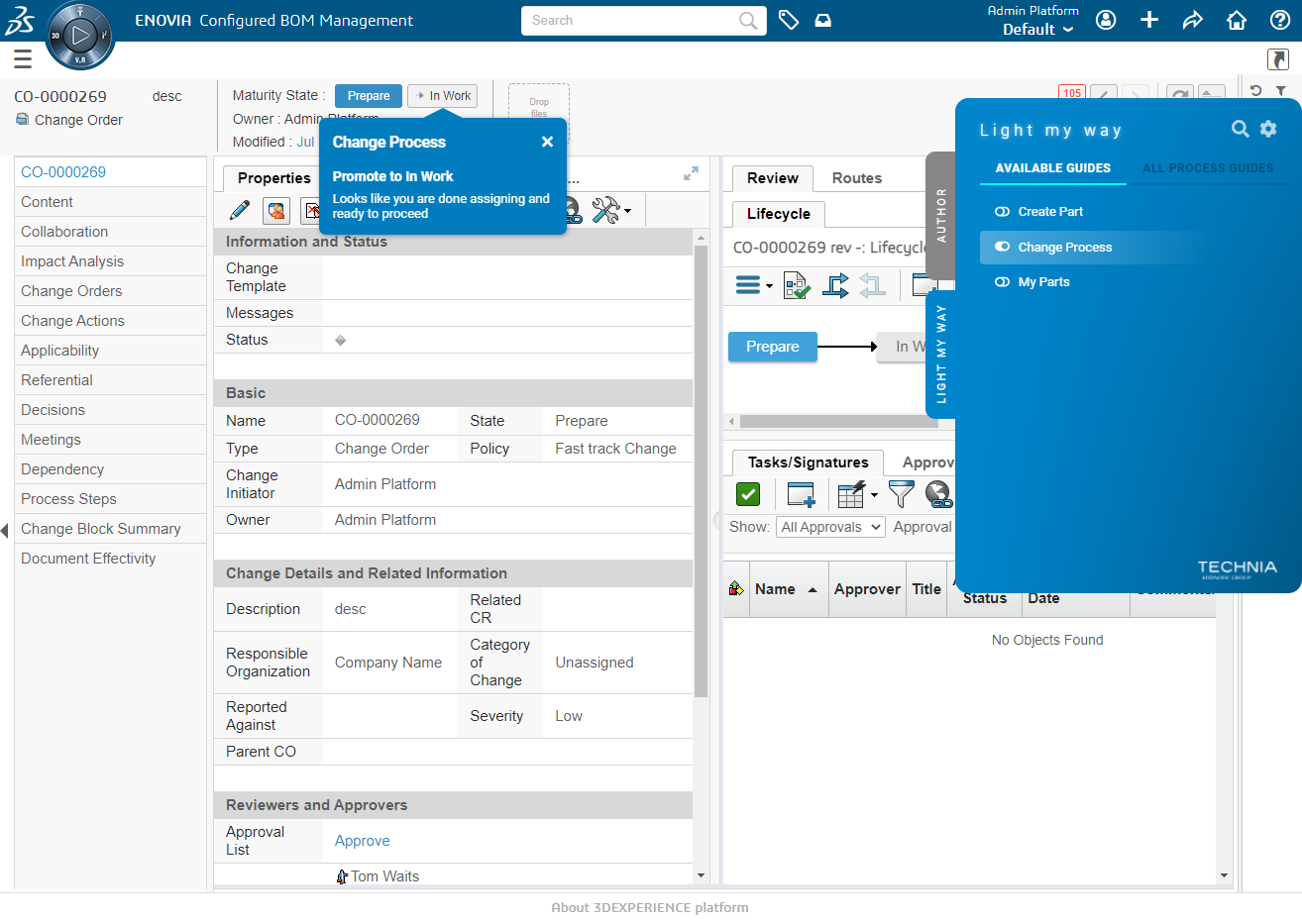
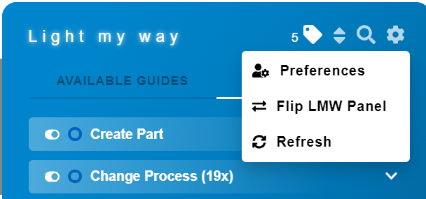
To consume in-app guides the web extension is used. The extension present guides recorded by the author based on the application state so that the right instruction is displayed at the right time. The consumer can choose among available guides from a panel tab at the side and guide callouts are presented just in time as the user click around in the application. The consumer will find the ‘LIGHT MY WAY’ tab at the right of the application. This tab will be used to access all guide content and control preference.
Guides
Each instruction belongs to a guide. A guide allows the consumer to enable a series of instructions in one go and is often equal to a use case, a process or a training chapter.
Toggle on/off
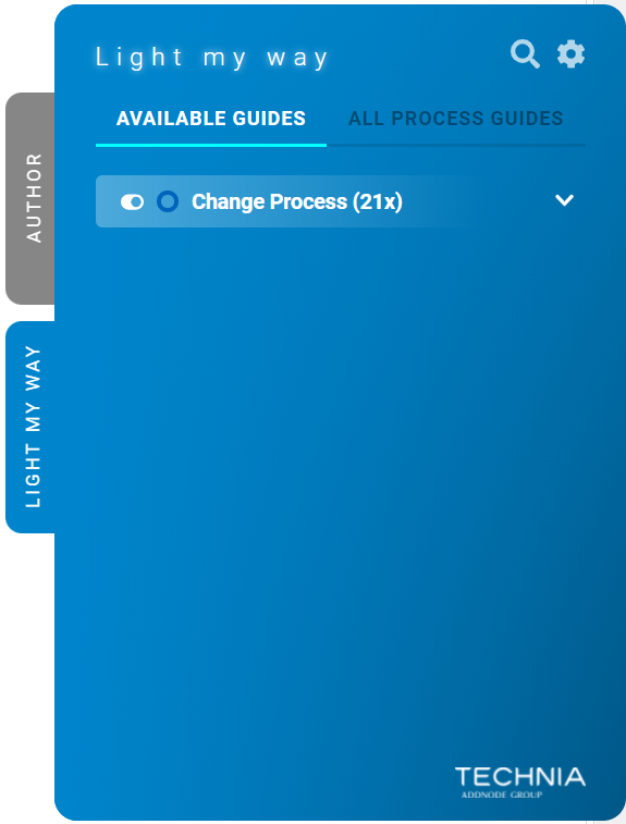
The consumer can toggle guides to be displayed on/off. The toggle state is persisted over time (browser local storage) and allows the user to keep his favorite guides on so that the right instruction automatically appears as the application state is right.
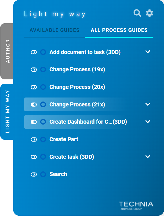

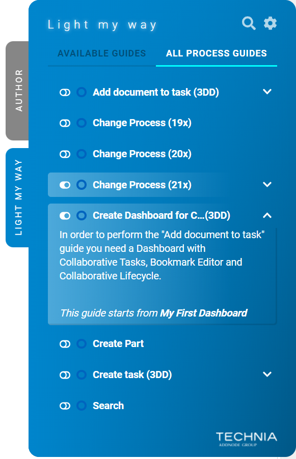
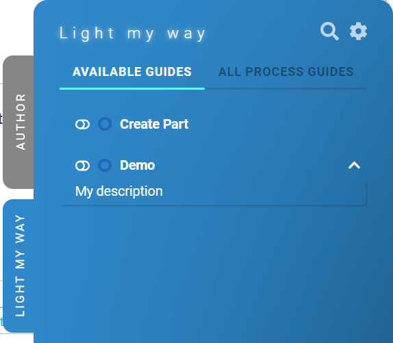
Available guides
To make it easy for users to find help relevant to the current view the guides, with at least one instruction valid for the current view (app statecontexts) is displayed on top.
The user also get aware there is help to get in case the panel tab is minimized. If there is a guide available but it is disabled a shining indication appears on the panel tab.


Finding guides
Users can find instruction guides by a filtering functionality. The filter field opens by clicking the search icon. Entered text will filter down the guide matching the text in labels, description and instruction content. The filter function is cancelled by pressing the arrow and any entered text is cleared by pressing the x.

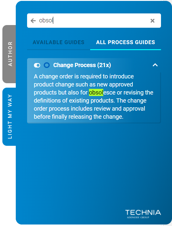
Description
A detailed description for each guide can be added by the author and is made available to the consumer by expanding an accordion. A good description makes the guide searchable and makes it easy for the consumer to understand what it is about and when it is made available.

Color
To easily differentiate between guides the author can assign different colors.
Guide colors are also displayed next to the guide name in the panel.

-20220303-153322.png?version=1&modificationDate=1680708426587&cacheVersion=1&api=v2&width=680)
-20220303-153322.png?version=1&modificationDate=1680708426587&cacheVersion=1&api=v2&width=233)
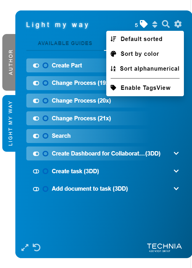
Sort Guides
Users can sort guides by color, alphanumerically or “Default sorted” (the order the Author has sorted them by) by clicking the sort icon.
By default the sorting is set to “Default sorted”.
Tags View
By clicking on “Enable TagsView” the guides will be grouped by tags.
For more information about tags see “Tags” below.

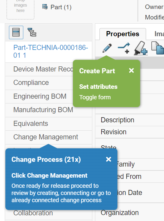
Instructions
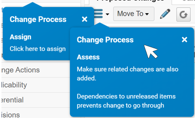
The visual callout elements that guides the user are called instructions.
Just-in-time delivery
To ensure that the right instruction appear at the right time, all callouts reacts and validates as the application state change.
Instructions valid for the current view and application state automatically appears on screen. With the condition context that its guide is toggled active.
In case of multiple instructions appearing on top of each other. The hovered instruction would go on top.
Dismissing instructions
In case an instruction callout is in the way it can be dismissed by clicking the x. Instruction dismissal is temporary and will appear next session as long as application state and group toggle state still say it should .

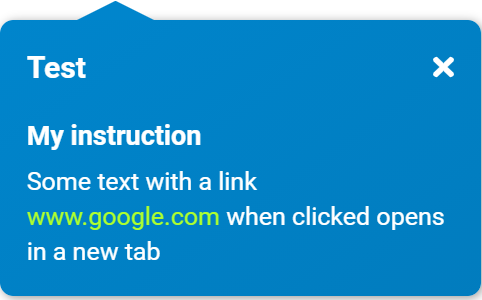
Links
Some instructions can contain links. When a link is clicked the content will open in a new browser tab.

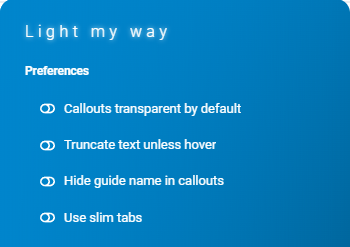
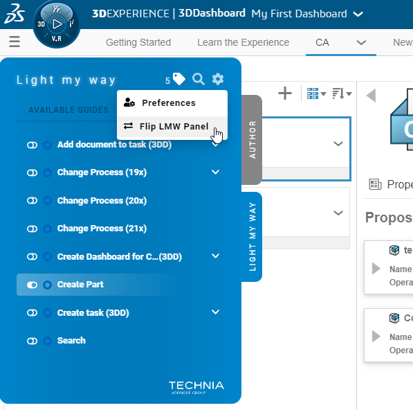
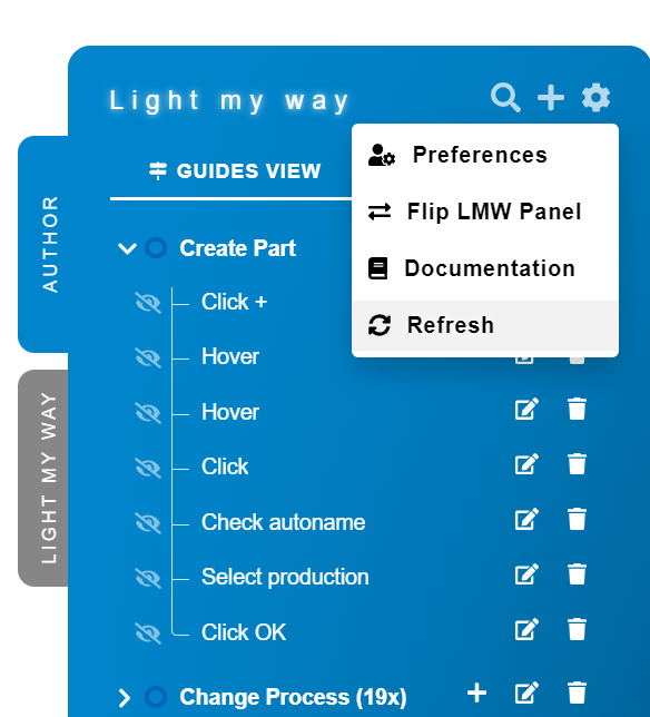
Preferences
To increase usability the consumer can control some of the behavior through preferences found at the top right corner of the panel.

UI Preferences
Under the preferences option the user can control callout layout and styling.
Use slim tabs
Make tabs smaller when toggled on.

Slim tabs | Default tabs |
  |   |
Flip LMW Panel
This is used to switch side of the panel from the right to the left and vice versa.
You can also flip the panel from the browser context menu by right-clicking the page and navigating to “Light My Way“ → “Flip Panel“.


Refresh
Reloads Light My Way with the latest data.

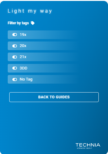
Tags
Filter listed guides by tags. Toggling tags on/off can be done from the tag icon found at the top right corner. By enabling at least one tag all guides will be filtered down to only include those matching the selected tags. Tag filtering is a good way to hide the guides not of value to you and allow you to focus on the ones that are.
| Info |
|---|
Tags can be used to filter instructions by role, experience level or any other label like detail level. Tags are set and maintained by the author, consumer selects the ones to filer by. |


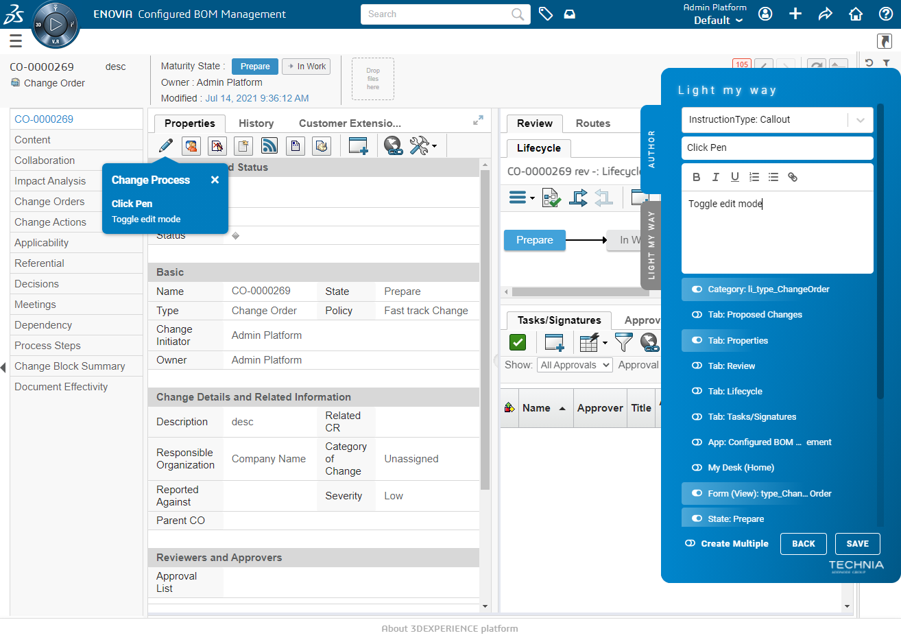
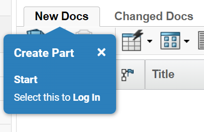
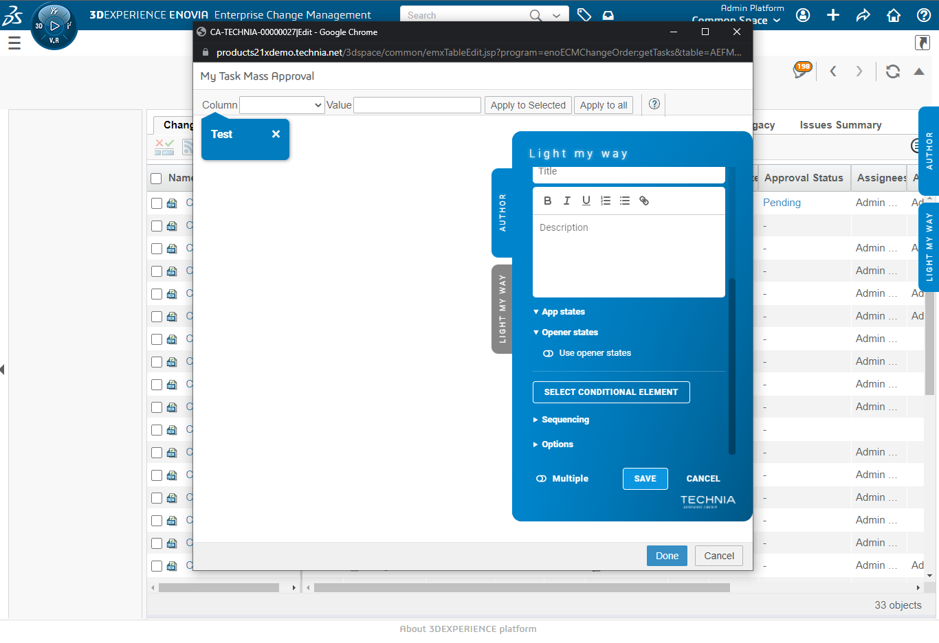
The Author
With the Author mode of the extension guides are recorded easily by point and click, without getting into the technical details, using pre-set configurations for the different platform target elements, app states contexts and contexts.
For the supported platforms, such as 3DEXPERIENCE, a rich and build-in default configuration is included with the product. The built-in platform configurations allows authors to:
Tie instructions to UI elements
Control when it should be shown.
The author extension has two tabs:
‘AUTHOR’
Used to record new or modify existing guides.
‘LIGHT MY WAY’
Used to test the guides exactly how the consumer would see it.
If for some reason the built-in configurations (targets, conditions contexts etc) is not enough, it is possible to extend it. Administrators can extend configurations (see the admin chapter). TECHNIA is also interested in extending the built-in configurations and standard platform product support.
Guides
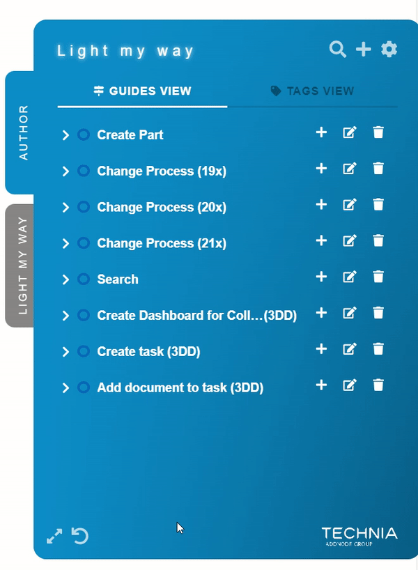
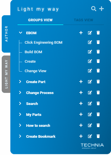
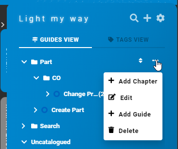
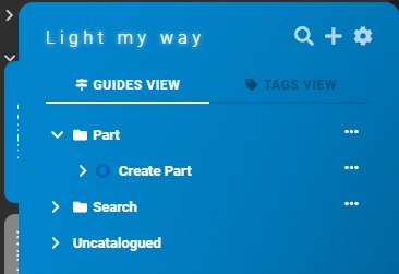
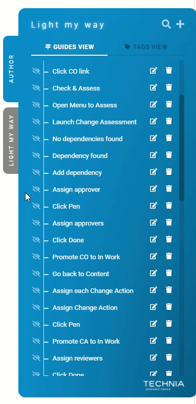
Listing Guides
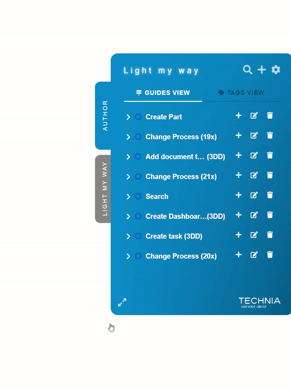
In the authors tab ‘GUIDES VIEW’ all guides are listed. Using the ‘TAGS VIEW’ guides can be navigated by tag and could be useful making it easy to find guides.
Deleting Guides
To delete a guide click the trash bin icon next to it
Modifying Guides
Clicking the edit icon next to a guide opens a form that allows modification.

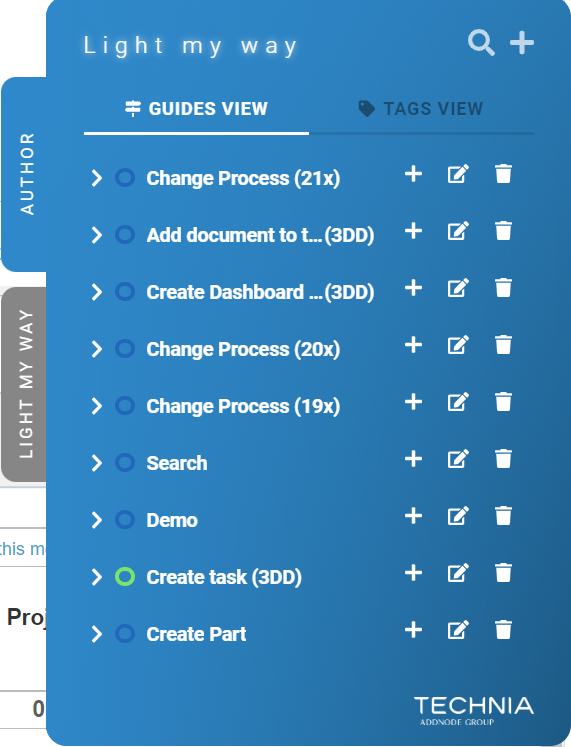
Ordering Guides
To change the order of guides simply move the mouse over a guide until you see the movement cursor. You can now use drag and drop to move the guide up or down in the list.
This order will be presented to the Consumer as “Default sorted”.

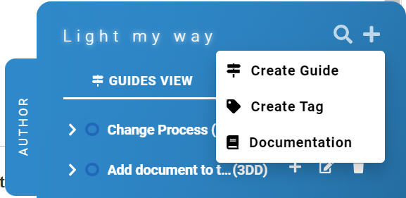
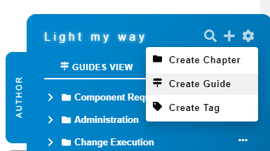
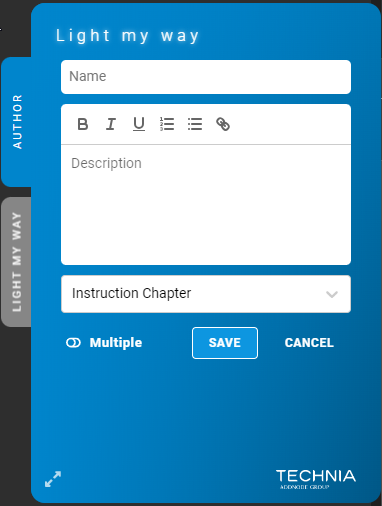
Creating Guides
Click ‘Create Guide’ from the + menu (found at the top right) to open the create form, fill out the form and click save.
Title
The title is presented to the author and consumer in the list of guides and is used to identify the guide. It is also presented as a header inside the instruction callouts.
Description
The description is presented to the consumer in the list of guides by expanding an accordion.
| Tip |
|---|
A good description is rich, contains many key words to make the guide searchable. It should also make it easy for the consumer to understand what the guide is about and when it is made available. |
Tags
A guide can be tagged with one or more tags allowing the consumer to filter out the guides that matters to him. Simply type the desired tags in the tags field to tie the guide with it.
Tags can be maintained in the preference menu later on.
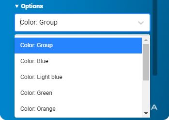
Color
The guide color controls the color of the callouts and also puts a colored circle in guide lists for easy identification.
Blue is the default color.
You can also change the color of a specific instructions by expanding Options and changing the color of that instruction.
Group is the default value, meaning same color as the Guide.


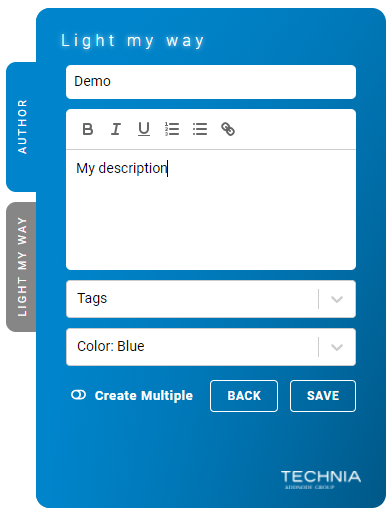

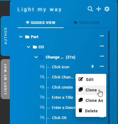
Cloning Guides
Guides as well as Instructions can be cloned using the “Clone“ or ”Clone as” actions. Where the “Clone“ action will create a copy and keeping the cone name, and “Clone as“ action will let you rename the guide/instruction before cloning.
Instructions
The visual callout elements that guide the user are called instructions.
Creating instructions
To create an instruction, go to the authoring tab and click the plus icon on the row of the guide you like to record. Added instructions will be added to the end of the list of instructions of that guide.
Modifying instructions
Find the instruction in the group tree list and click the edit icon next to it. For visible callouts it is possible to open the edit form directly by clicking the edit icon.
Ordering instructions
To change the order of instructions simply move the mouse over an instruction until you see the movement cursor. You can now use drag and drop to move the instruction up or down in the list.
| Info |
|---|
As app state context is used to define when instructions are shown, the order of the instructions have no effect on the display sequence. Order is currently only used by authors to structure their work. |

Selecting targets
When adding an instruction, the author is automatically in target selection mode. Press ctrl+click or ctrl+space to submit your selection.
| Info |
|---|
During selection you can find related information in the info footer at the bottom of the page. |
There are two ways of pointing out targets.
Supported targets (green)
The preferred method of selecting target elements is by using one of the built-in and supported green targets. The supported targets identification is carefully considered and maintained as part of the product. Supported targets are quality assured, cleaned off version specifics and html detail so that only a minimum required to identify the element is recorded with the instruction data. The complex and potential changing part is maintained in the configuration as part of the product.
Fall back - XPATH based targets (yellow)
To provide flexibility there is also a fall-back target recording method using xpath. You could see xpath as more of a direct map through the html elements to your target element. Using the flexibility of xpath you can record anything you want but you will also tie your instruction closer to the html and it will be more sensitive to change. More html version specifics will end up in the recorded data. We support this recording method but not the specific targets. Built in with the product is a set of ignored classes attributes etc to generate a good xpath starting point that is likely to work well as a start.
Colored rectangle
During selection a colored rectangle will appear to indicate:
The element that is targeted for selection
The status of the selection
Rectangle Color | Meaning |
|---|---|
Green | Supported selection |
Yellow | xpath based selection |
Red | Unable to record |
Grey | Displayed in combination with the red rectangle to indicate that the element is not unique. |
| Tip |
|---|
Building guides using supported (green) selects makes your recordings more stable over time (minimize risk of re-recording when upgrading etc). |
Highlight all supported (green) targets
All supported (green) select targets can be highlighted by pressing ctrl + alt
Submitting your selection
To complete selection hold control key and left click mouse (ctrl + click) or press space (ctrl + space). Control + space is useful in cases when the target platform reacts to mouse click and prevents recording.


Re-selecting target elements
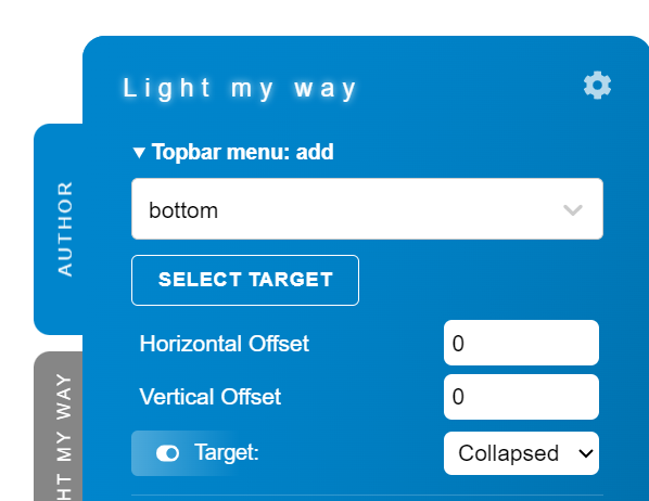
To re-select the target element, click the ‘SELECT TARGET’ button below the ‘Target element’ label found at the top of the instruction form.
| Note |
|---|
Be aware selected app states contexts will reset to match the state during the new selection. |
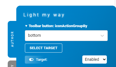

Advanced innerText controls
To use advanced innerText controls, select a supported target element that is using innerText, then open the target details form and you will be able to change the behaviour of innerText evaluation. If the target element innerText should be equal, contain, startWith or endWith the chosen text.
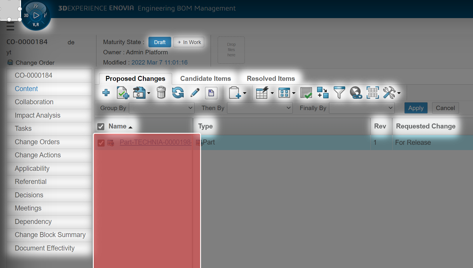
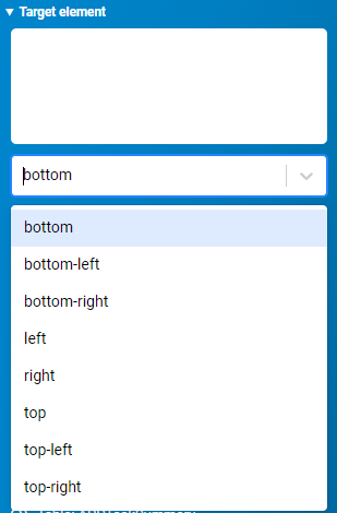
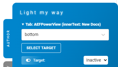
Callout positioning (anchors)
A callout positioning choice could be done during selection by clicking one of the anchor points (grey small circles) at the edge of the rectangle. For some targets, such has really small ones, the anchor points on target selection are disabled by the administrator.

Callout positioning (panel form)
A callout is possible to position in a number of ways. To select the position, use the drop down. Default position is bottom.
Note that the anchor point could be assigned during target selection (see ‘Selecting Target Elements’).

Callout positioning (offset)
A callout can also be re-positioned from its anchor position with horizontal and vertical offset (+/- in pixels).
| Info |
|---|
If the callout doesn’t fit in the new position it will be re-positioned to a new position and the offset will be ignored. |

Preview instructions
While creating or modifying instruction an instant preview is made available. The preview instantly reacts and displays changes in text just as the consumer would see it.

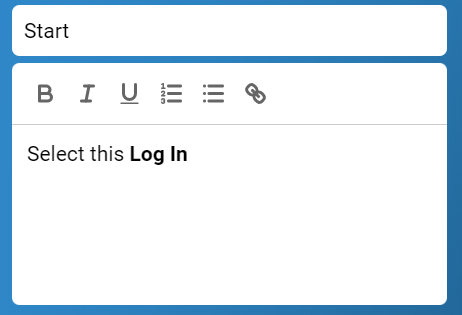
Instruction text
Instructions has two fields. The title renders in bold and the description renders as paragraph and is suitable for longer texts.
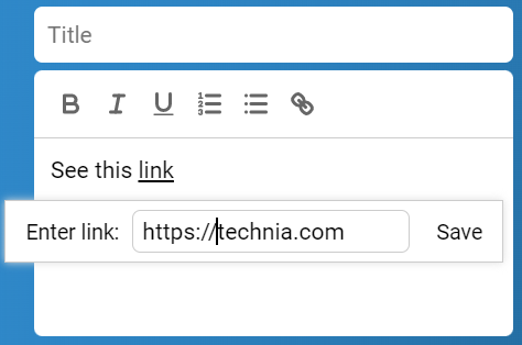
The description field features a rich text editor which allows you to apply basic formatting with links, lists.


Links
To add a link to an instruction simply enter the link text and then click on the link icon in the editor to add the URL.
| Tip |
|---|
Links could be very useful to direct users into the right chapter in classic documentation or information hosted elsewhere. |


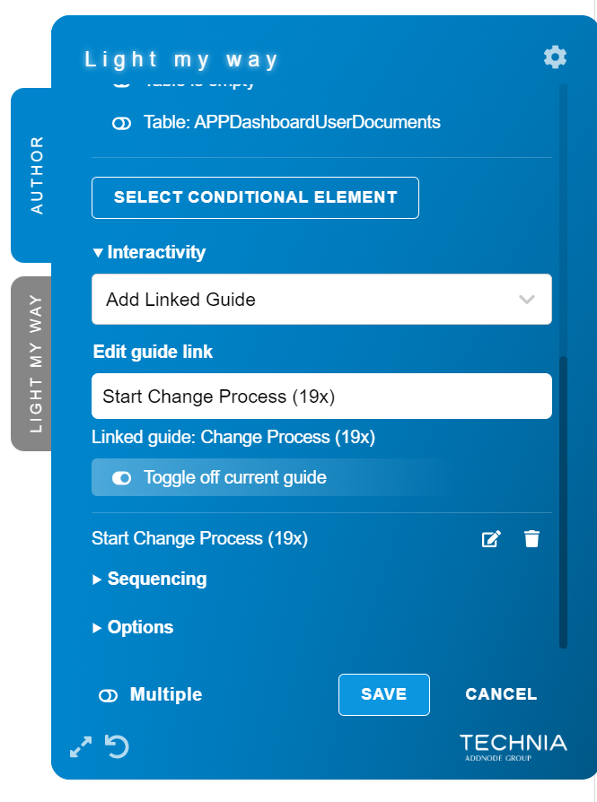
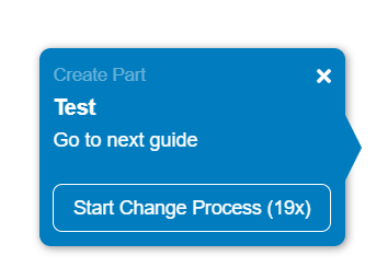
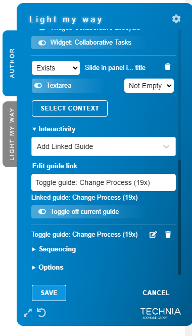
Interactivity
Linked guides
Under “Interactivity” you can add linked guides to an instruction.
This will show up as a button in the bottom part of the callout.
Toggle off current guide
If you toggle on “Toggle off current guide” clicking the button will toggle off the current guide and toggle on the linked guide.
If you don’t toggle on “Toggle off current guide” clicking the button will only toggle the linked guide.

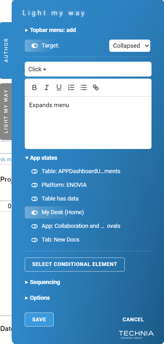
Controlling when instructions are shown
There are various ways to control when an instruction should show.
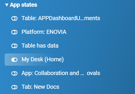
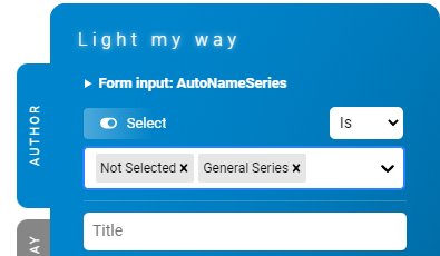
App statesContexts
To control when an instruction is shown, it is tied with application state. This is achieved by selecting among a set of built-in app states contexts valid for the current view.
Hovering an app state a context in the list will highlight the element in the current view that the app state context is tied to.
| Info |
|---|
E.g. an instruction can be tied to a specific object type or lifecycle state so that it only shows up as these app states contexts are met. |
| Tip |
|---|
Using app states contexts are good for performance. It filters out instructions for evaluation based on state matching the current view. |

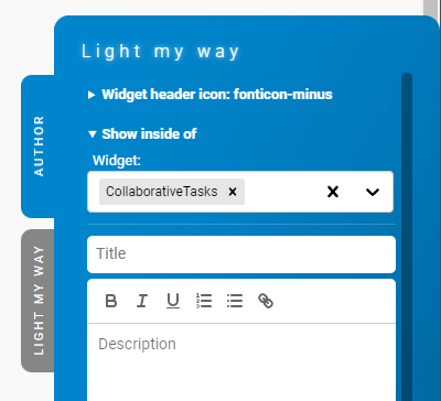
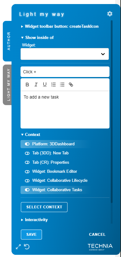
Inside of
There are cases when the target element selection is ambiguous and generates multiple hits in the UI. In such cases you can use “Show inside of” to limit the context.
You can select multiple “Show inside of“ and in that case the callout will be rendered in the first available condition container.
| Info |
|---|
E.g. when selecting an element that is available in multiple widgets within the same view it can be tied to be within one specifically. |

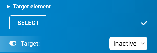
Target state
Some target elements could have a state itself. Such elements can be configured with a target state that controls instruction visibility.
| Info |
|---|
E.g. tabs can be configured with a target state so that the author can control instruction visibility depending on if it is active. |


Targeting input fields
Targeting input fields will always present the option to control state. e.g. text field, textarea, checkbox, radio button, select (dropdown), file upload. etc. will all present a state option to the author.

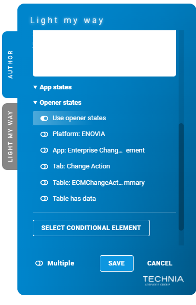
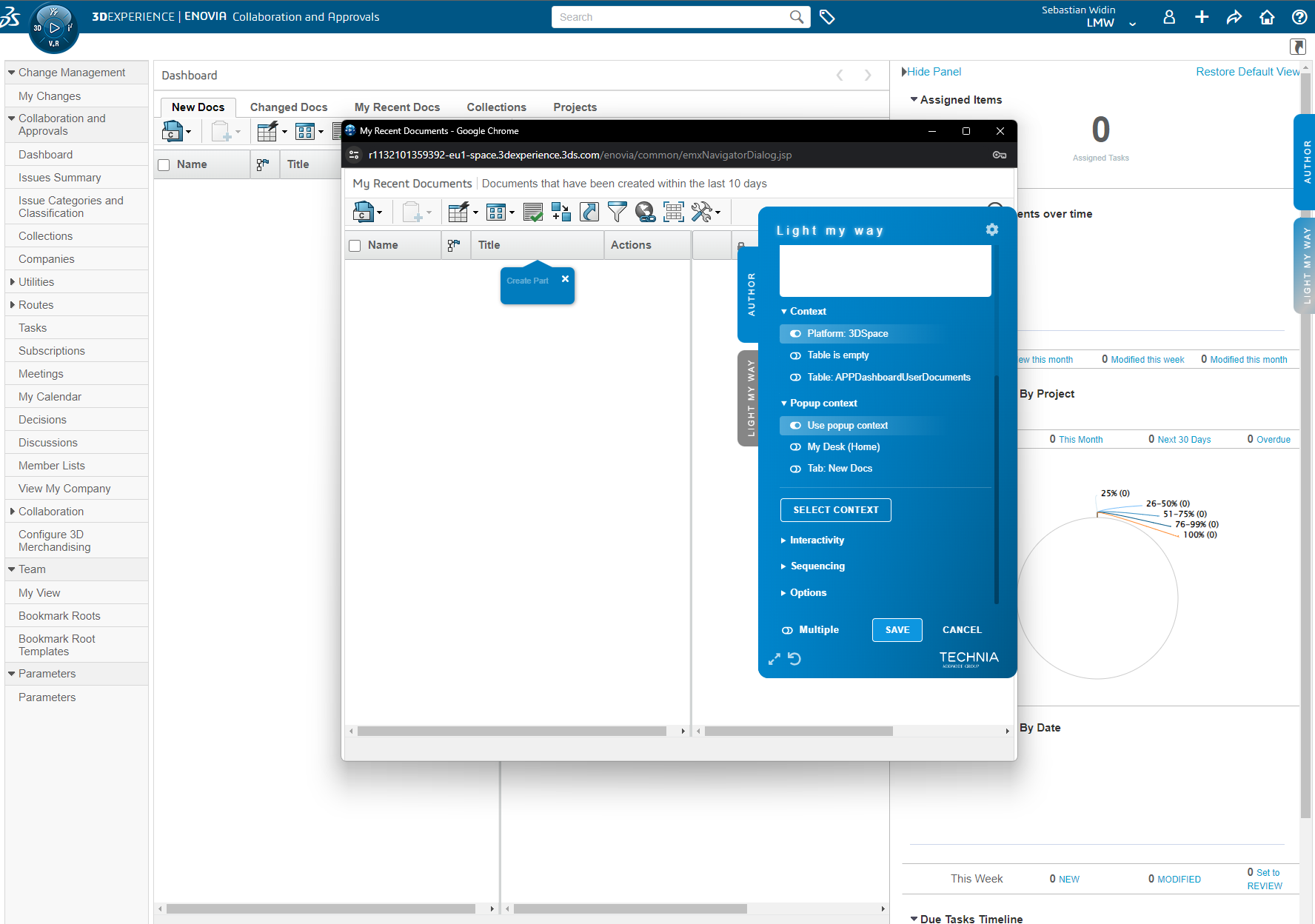
Popup context
If you have placed an instruction in a popup window you get the option to add the opener window app states contexts to control visibility of the instruction.
This is useful since the popup itself usually lack information about the state of the app and with the opener states popup context you can tie the instruction to the state of the app when opening the popup.
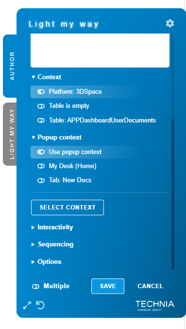
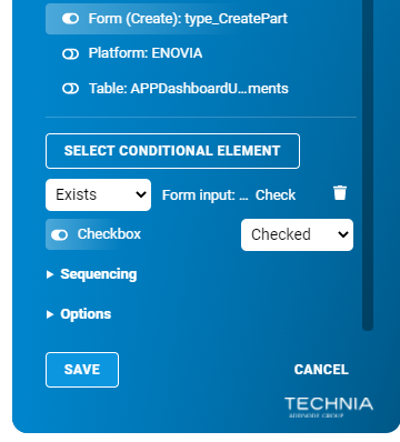
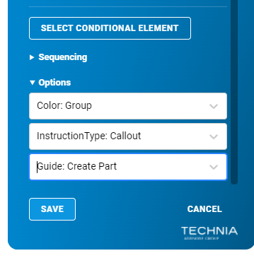
Manually selected Context elements (Sequencing by state)
If the built-in standard app states contexts are not enough to control visibility of an instruction, one or more conditional context elements could be used. Target states also apply to conditional manually selected context elements and using it in combination is a powerful way to control sequential flow. Multiple conditional context elements could be used in combination so that all conditions have to be met for the callout instruction to display.
| Info |
|---|
E.g. if you have a series of callouts in a form that you want to display in sequence. Conditional Context elements can be used so that the second callout appear after the first field has been filled out. |
| Tip |
|---|
Using conditional Context elements is the preferred (over direct dependencies) way to build sequences. |
Sequencing (Fall-back)
| Note |
|---|
Direct dependency sequencing is a fall-back method and your last resort as complex dependencies to other callouts makes it hard to maintain over time. Instead try to achieve the desired behaviour using conditions and conditional elementscontexts. |
Display one instruction after another with help of making instructions directly dependent on each other. Select the instruction you want to make a dependency to in the dropdowns. In the case multiple instructions are used as display after / before only one have to be shown to fulfil the requirement. The instruction sequence can be followed multiple times by specifying when the sequence should reset.
| Info |
|---|
E.g. you can specify that an instruction only should be shown after another instruction has been shown. Example picture shows the sequence options for an instruction that is in the middle (in between two other instructions) in a sequence dependency chain. |
| Warning |
|---|
Always use a carefully considered reset to allow multiple sequence iterations within the same session. |
-20220303-145545.png?version=1&modificationDate=1680708426679&cacheVersion=1&api=v2)
-20220303-145545.png?version=1&modificationDate=1680708426679&cacheVersion=1&api=v2&width=233)
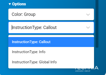
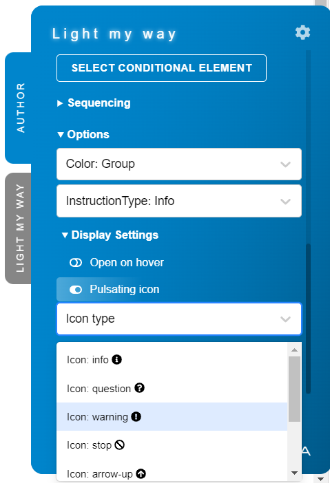
Instruction Type
You can change type of the instruction under “Options”.
Types
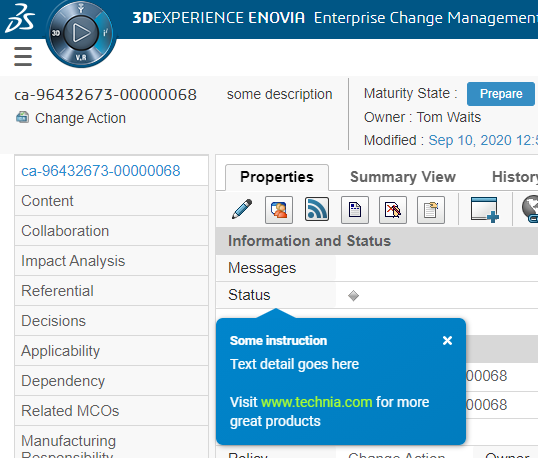
Callout: Renders the default callout popover pointing to the selected element.
Info: Renders the instructions more compact. Then the user will have to actively click the small info symbol to render the full callout.
Optional: Under “Display Settings” there are additional settings for the Info type:Open on hover: You can toggle “Open on hover” to have the full callout rendered when hovering the instruction instead on having to click.
Pulsating icon (enabled by default): If toggled off the info symbol will be static and not animate.
Icon type (Info
 by default): You can select between multiple different icon types e.g. question mark, warning, arrows etc.
Global Info: Renders a global info overlay on top or bottom of the page (not pointing to a specific element).


Move to another guide
You can change which guide an instruction should belong to.

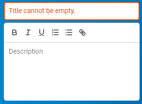
Validation
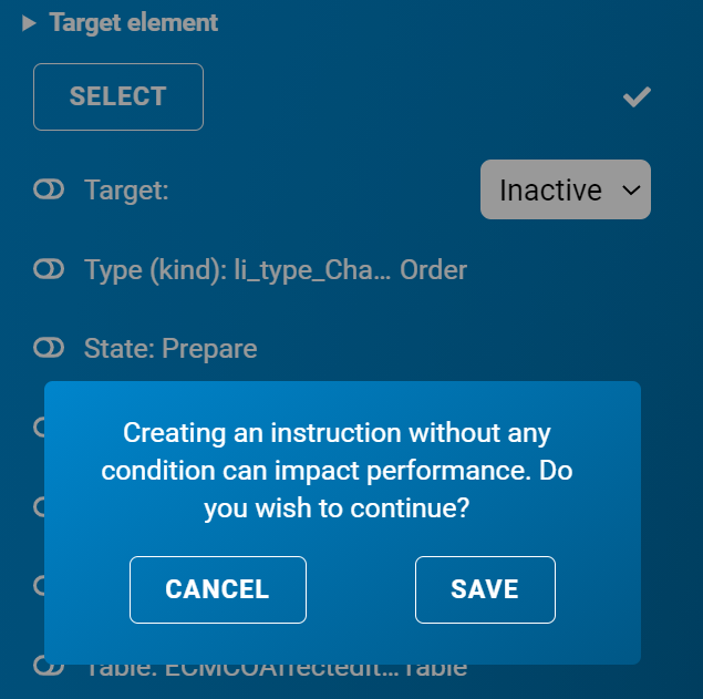
To ensure proper data some validation is applied to the instruction create / edit form.
At least 1 condition context is needed otherwise a warning is displayed
Title is mandatory
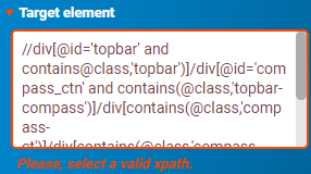
If used recorded XPATH have to be valid (details found when expanding target element)


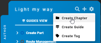
Chapters
To easier be able to group Guides together you can create a Chapter. You can add a Guide to a Chapter form the guide edit form or the action menu. Chapters can also have their own sub chapters.
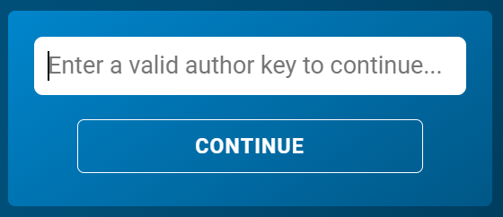
Password
To ensure unauthorized authoring a password is required the first time the author tab is used. The password will be stored in local storage, so you don't have to enter it the next time authoring using the same machine.

Evaluation status
In order to help you understand if and why an instruction is (or isn’t) visible the status of the evaluation is shown to the left of the instruction.
An open eye icon indicates that the instruction is visible
If the icon is yellow the instruction is using XPATH-based targets
A closed eye icon indicates that the instruction is not visible
If the icon is yellow the instruction is using XPATH-based targets
| Info |
|---|
If you hover the icon you will get more details on which conditions contexts (and other evaluated states and elements) are present and evaluated in the current view. |

The Administrator
To enable authors to record guides easily by point and click, without getting into the technical details, pre-set configurations are used to control how things are recorded for different platform target elements and app statescontexts.
As example these configurations control
How target elements are identified
The app state conditions contexts used to control when instructions should show
For the supported platforms, such as 3DEXPERIENCE, rich and build-in default configuration are included with the product.
To allow authors to record new, customized or for other reason modify or override configurations to better fit customer specific needs it is possible to extend these configurations.
TECHNIA is interested in extending the built-in configurations and standard platform product support.
General
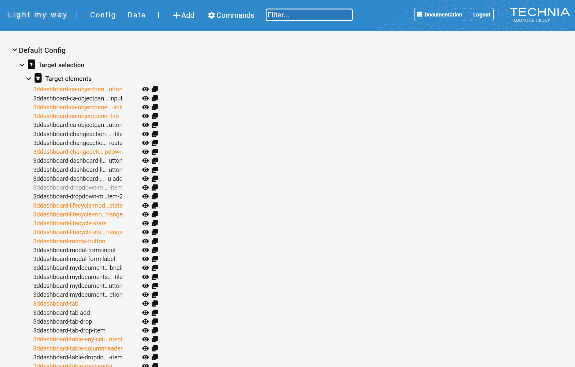
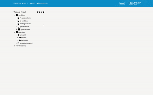
To overview all recorded data, export/import or to better support your authors specific recording needs, there is an Admin UI. In the admin UI you can easily create, edit and remove configuration items (e.g. app statescontexts). The admin UI is web based and available with any supported browser.
| Info |
|---|
To access the Admin UI go to https://lmw.technia.cloud/admin The Admin UI is protected by login authentication using your username and password (that you get with your subscription). |

Config
Edit & Delete
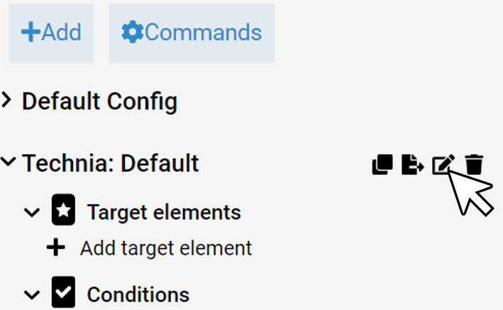
To edit or remove a configuration item simply choose the target platform in the tree list and the configuration item you want to edit or remove.

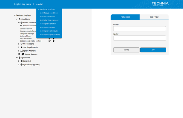
Add
To add a new configuration item either click on the add button in the tree list under the chosen configuration type or click “+ Add” in the top bar.

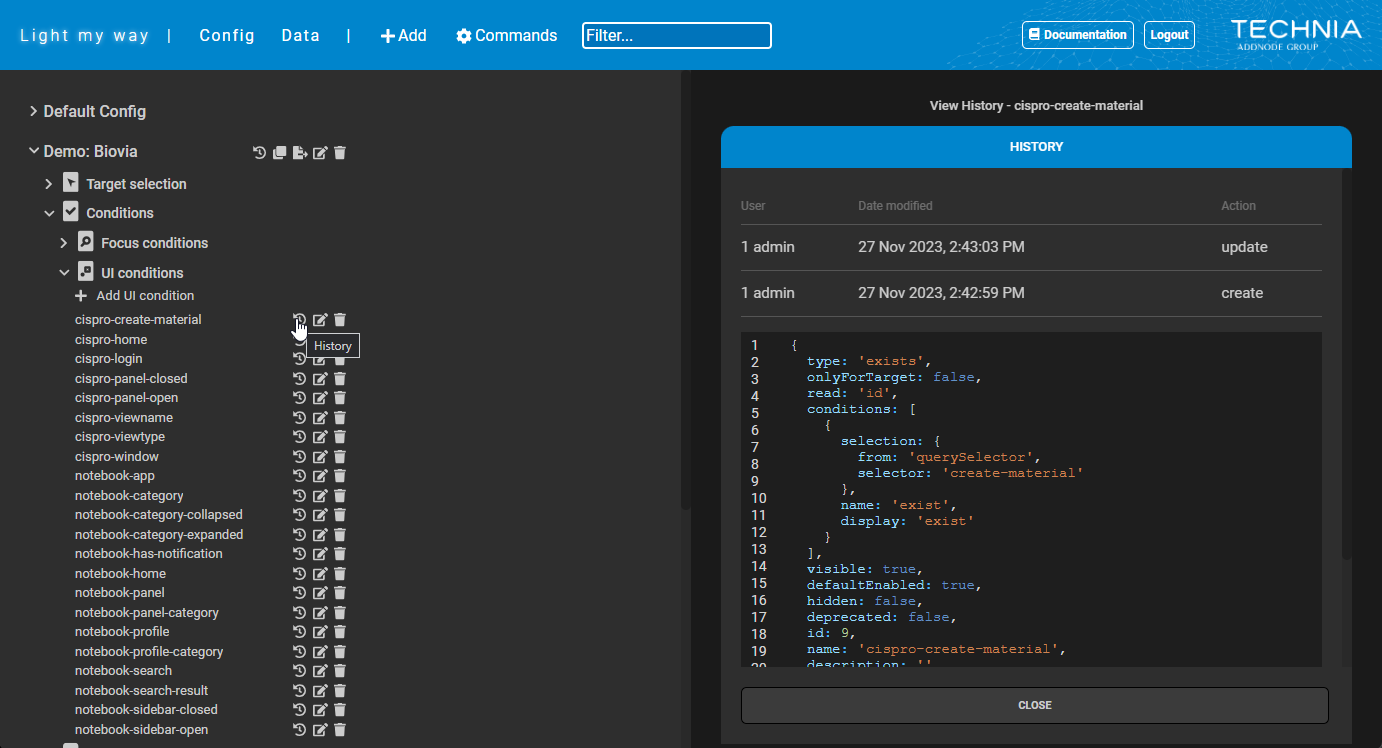
History
Check configurations history, e.g. who and when created or modified a UI Condition context or Target Element.
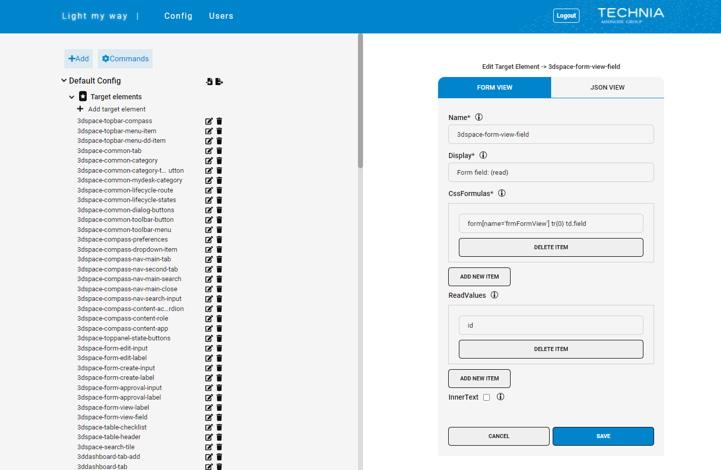
Target elements (green targets)
| Tip |
|---|
This is the preferred method for authors to select target elements and will only store key value identifiers of the target with the instruction data. The selector used to identify the target is maintained as configuration and makes it possible to improve over time. |
This is the method of the built in and with product supported green targets.
Targets defined this way will be presented in highlight and green to authors (as the supported targets).
Administrators could extend the list of target elements to indicate good target selections to their users.
To create a new target either clone an existing one or add a new one by clicking on the “+ Add” in the top bar and choose “Create New Target”.
CSS-based target formulas
Target elements defined using CSS-based formulas.
Example:
Formula: form[name='frmFormView'] tr{0} td.field
Read value: id
In this case the stored data on the instruction is the id of the parent tr but the selected element will be the child td.field.
This can be done with multiple read values and multiple formulas enabling platform independent targets with different css selectors but same matching unique identifier (read values)
XPATH-based target formulas
Target elements can also be defined using XPATH-based formulas.
| Note |
|---|
XPATH should be used only where a CSS formula is not possible, as XPATH formulas are more complex and slower to evaluate, they should only be used when necessary. |
Reasons to use XPATH formulas could be that the desired target element has styling: 'pointer-events: none', an overlapping element is blocking the target element with unique identifier or there is some other advanced pathing needed.
Defining a target element using xpath formulas and readvalues is done the same way as with css formulas, however there are some considerations to make a valid xpath.
When using readvalues in xpath formula the index '{0}' is replaced by ` and contains(@attribute, 'attributevalue')` for each readvalue in the formula.
The xpath formula with readvalues must contain some base identifier to make it evaluable without a readvalue.
Examples:
 //div[{0}] => //div[ and contains(@attribute,'value')]
✅ //div[@id='topbar' {0}] => //div[@id='topbar' and contains(@attribute,'value')]
✅ //div[contains(@class,'topbar') {0}] => //div[contains(@class,'topbar') and contains(@attribute,'value')]
Fields
Name | a unique id to identify this type of target |
Display | how to present the condition target to the author |
CSS Formulas | css selector-based formulas used to match the target element and read value |
XPATH Formulas | xpath selector formula used to match the target element and read value |
Read Values | the unique data used to
|
Inner Text | if checked the inner text of the target will be stored as a read value and matched with the selected target |
| Note |
|---|
Focus configuration will affect green or highlighted target elements |

XPATH based (yellow) targets
To provide flexibility there is also a fall back target recording method using xpath. Using the flexibility of xpath authors can record anything they want but will also tie instruction closer to the html and it will be more sensitive to change. When selecting a yellow fall back element an xpath is automatically generated. Multiple configuration types are used to control how xpaths are generated.
Built in with the product is a set of ignored classes attributes etc to generate a good xpath starting point.
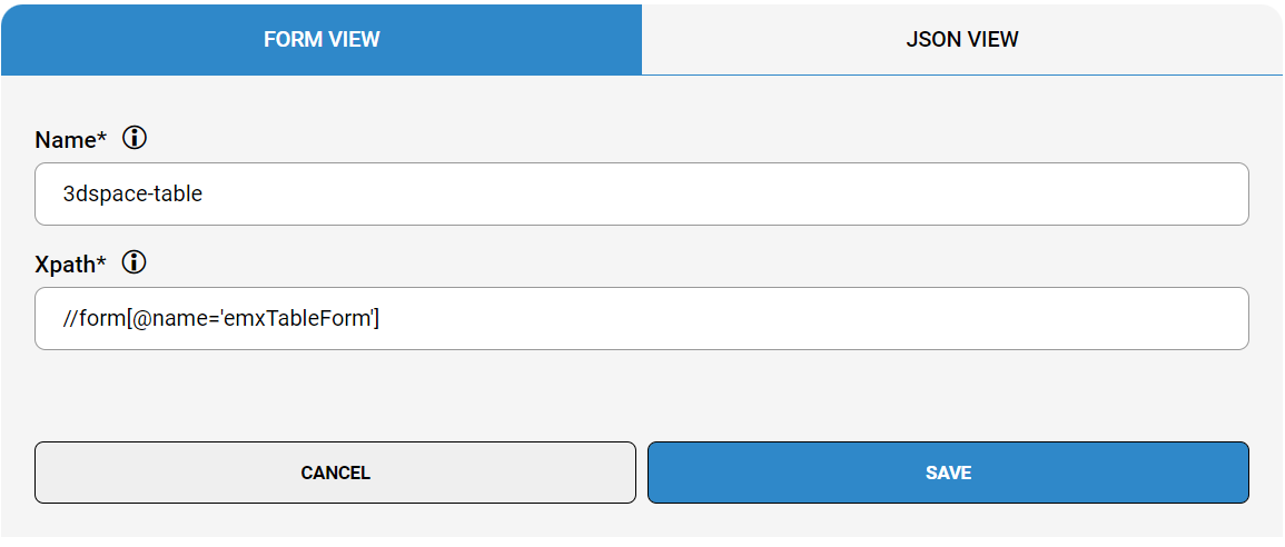
Starting Elements
Starting elements are used to truncate all XPATH before the matching starting element. This to make the stored XPATH nice, clean and less sensitive to context, changes or version.
Starting elements are defined using XPATH.
Fields
Name | A description used to understand what the starting element does |
Xpath | an xpath expression, if matched somewhere in the parent structure during target element selection, the recorded data address will start from this point and all xpath beyond this point will be omitted |
| Note |
|---|
Using the Focus feature, it is mandatory for target element's selection to start within the focus area. I.e. starting elements have to start on or within the focused area or it will be excluded from evaluation. |
| Note |
|---|
Making a too short XPATH would require to control more of when to show the instruction using app state / ui conditionscontexts. |
| Note |
|---|
For the staring element to match, the data have to be part of the generated xpath (can not be in the ignored list) |

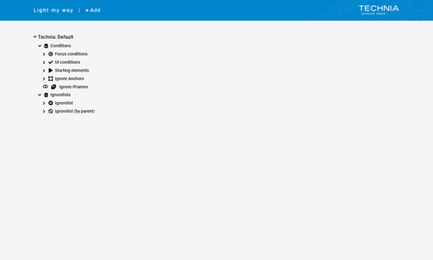
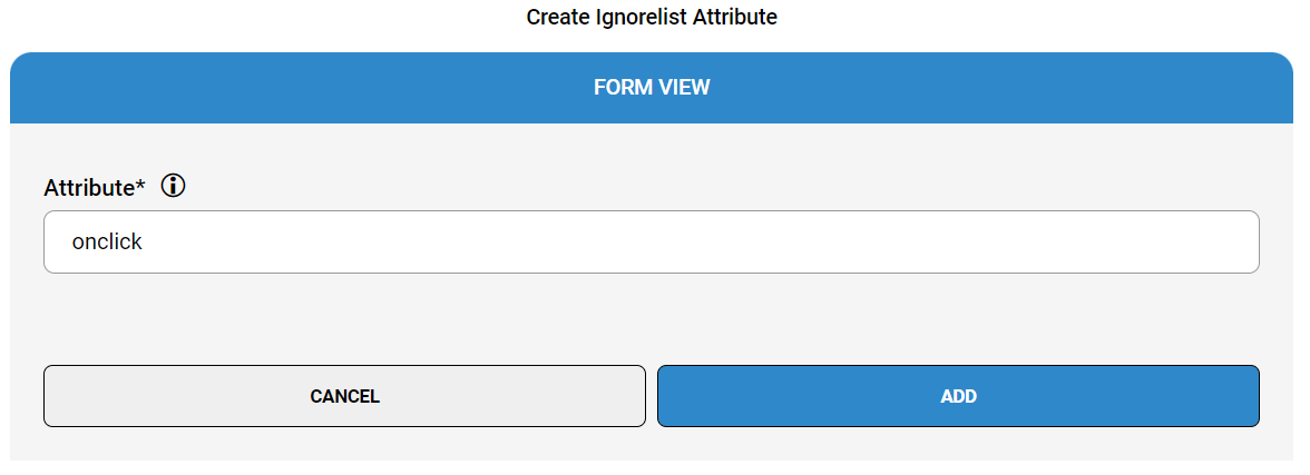
Ignore Lists
Ignore lists are used to define the class or attribute names to exclude from the recorded XPATH. This to make the stored XPATH nice, clean and less sensitive to context, session, changes over time or version.
Fields
Class | the class to be ignored in the recorded data |
Attribute | the attribute to be ignored in the recorded data |
| Note |
|---|
The ignore list configurations are global and will affect all view and target element XPATH selection. Only class and attributes that should be avoided in all cases should go here. |

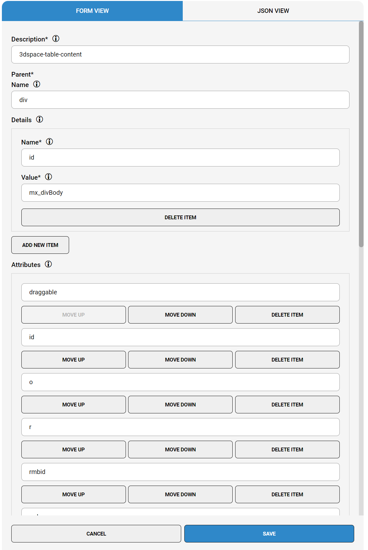
Ignore By Parent
Ignore by parent is used as ignore lists but will make the configuration valid within the scope of a specific parent only. This would be useful if you like to exclude common attributes like name in a specific scope only but retain it in other places. The name and details fields are used to identify parent elements. Attribute, Classes and Inner text to control ignore behavior in scope of that parent.
Fields
Description | used by admins to understand what is covered |
Parent Name | the element type used to identify the parent element |
Details Name | the attribute name used to identify the parent element |
Details Value | the value of the matched attribute used to identify the parent element |
Attributes | the list of attributes to ignore in scope of the matched parent element |
Classes | the list of classes to be ignored in the scope of the matched parent element |
Inner Text | if checked the inner text of targets within the scope of the matched parent will be included |
| Note |
|---|
To avoid the risk of ignore configuration affecting recordings for other parts of the application in a negative way, using by parent scope is good practice. |

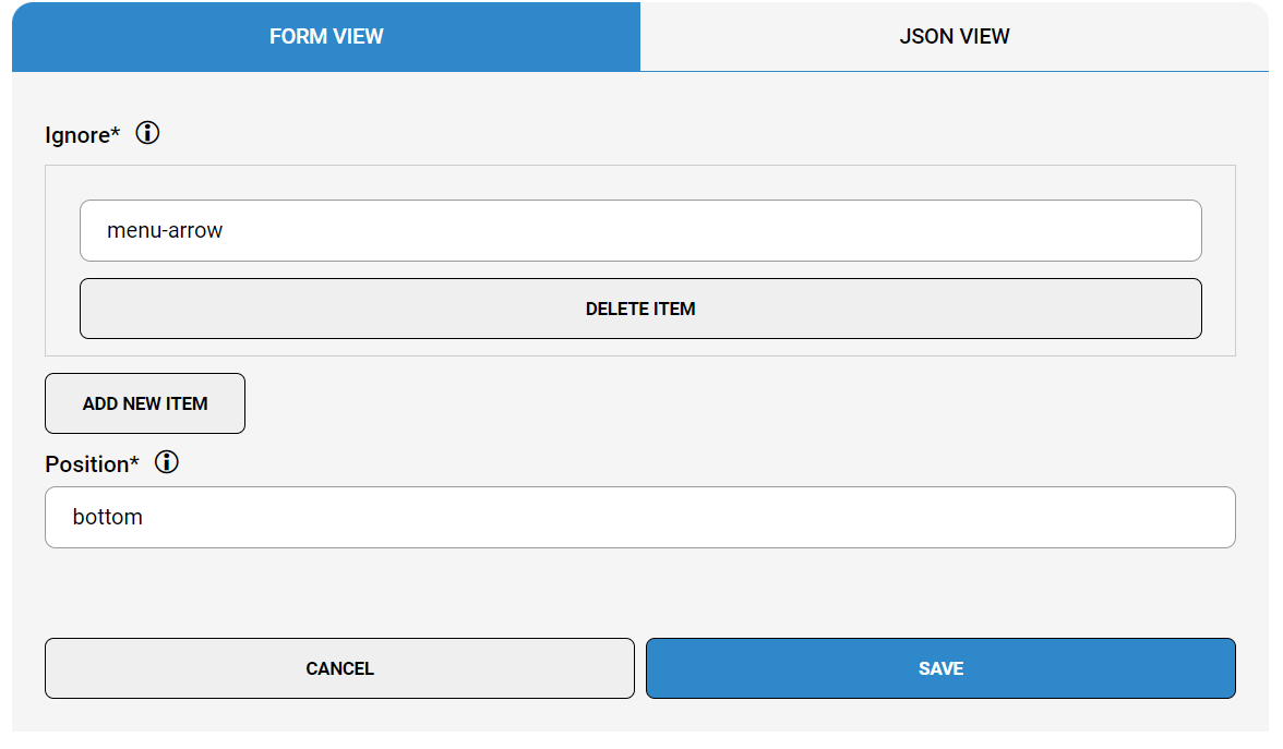
Ignore Anchors
Ignoring anchors points during target selection could be useful for cases when it does not work well. Anchor points could be problematic for very small targets or if the target by script automation disappear as you hover an anchor point and then it makes sense to inactivate it. In these cases you could instead define a default and the author could always control this in the next step using the advanced settings for the instruction.
Fields
Ignore | a list of classes to identify elements that should be ignored |
Position | the default position to be used in case of match |


Controlling when instructions are shown
To make instructions show at the right time, the recordings have to react properly to application state. For this to happen there are some different configurations related. While ‘App states’ ‘Contexts’ and ‘Target states’ are presented for the author to choose, the ‘Focus’ condition is silently used in the background.
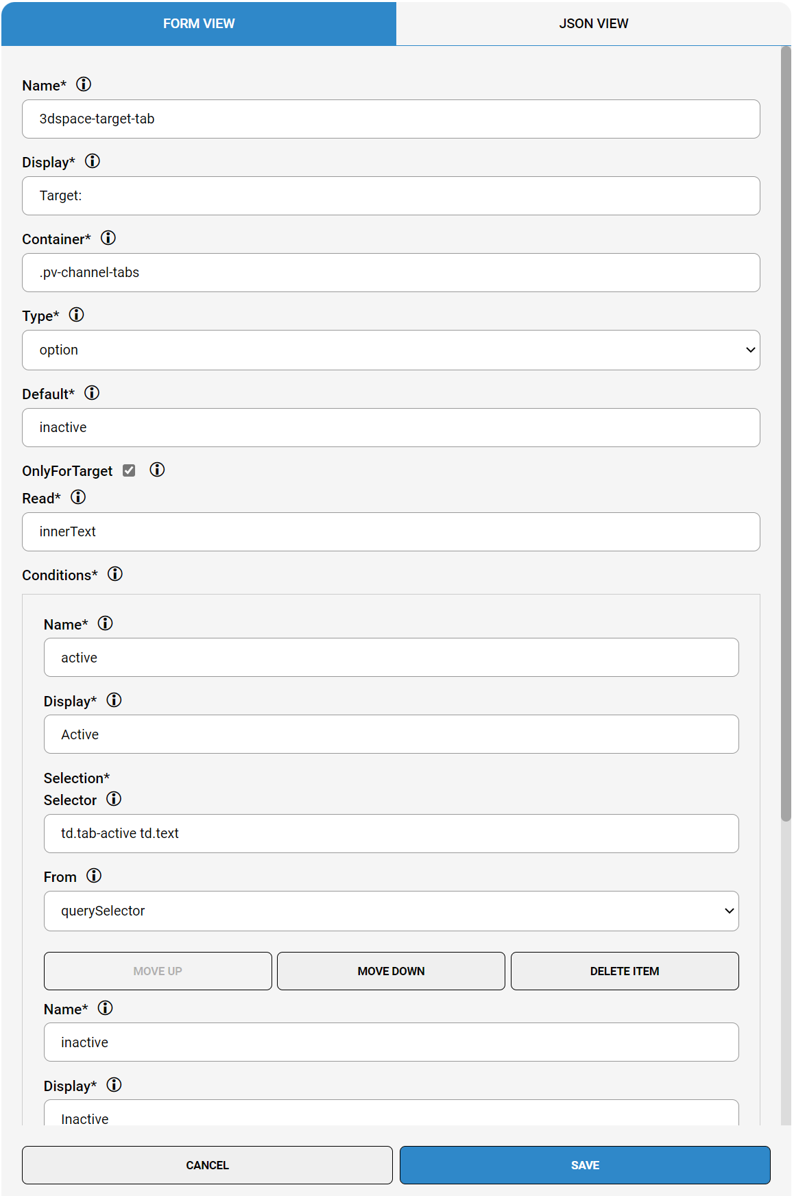
Contexts
The list of app states contexts is used by authors to control when an instruction is shown/evaluated. The list of app states of contexts is controlled in the Admin UI and is only presented to the author if available for inclusion with the current target selection.
The app states contexts are configured using CSS selectors.
Fields
Name | a unique id |
Display | how to present the condition context to the author |
Container | the element to use as base for the condition context evaluation |
Type |
|
Default | the default condition name |
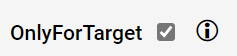
Only for target | evaluate the condition context for selected target element only (see target conditionsstates) |
Read | the unique data used to
|
Conditions Name | a unique id for the condition option |
Conditions Display | Displayed to author in drop down in case of option type |
Conditions Selection Selector | css selector to match the element |
Conditions From | The evaluation technology |
Visible | Require the condition context element to also be visible otherwise excluded |
Default Enabled | Defaults the condition context to be toggled for inclusion as the author records |
Hidden | Hides the condition context under expandable more section |
| Tip |
|---|
Using conditions contexts is good for performance as it filters out instructions for evaluation based on matching condition context state for the current view. |

Target states
State specific to the selected target element is used to control when a callout should display when the target itself carries state.
The target states are configured using CSS selectors the same way as app statescontexts, but you simply check only for target checkbox.

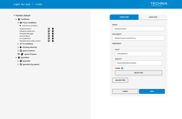
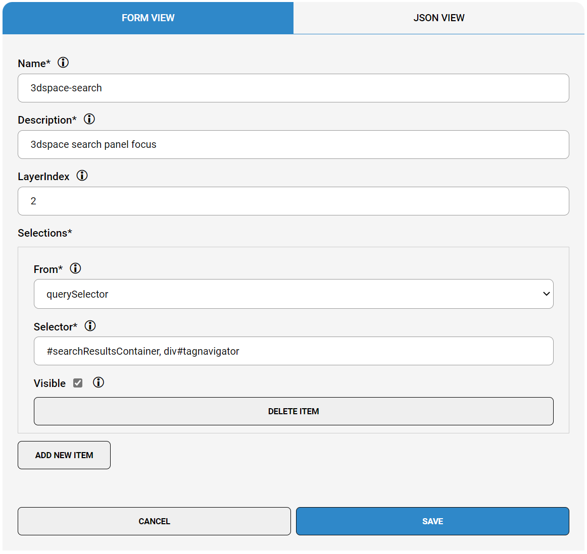
Focus conditions
Focus conditions are used to limit evaluation within the focused element if present. Very useful to make all other callouts not in the focus group automatically hide as long as the focus condition is fulfilled (e.g. hide background callouts when search is open). Focus is a silent feature and the author is not aware this actually happens behind the scenes.
Focus conditions are configured using CSS selectors.
Fields
Name | a unique identifier |
Description | used by admins to understand why it was added |
Layer Index | defines priority in case of multiple focus elements is found |
From | css query selector currently only supported |
Selector | css selector to identify the focus element |
Visible | if the focus element have to be visible to be valid |
| Tip |
|---|
Using focus is good for performance as it limits the evaluation to happen within the focus element. |
| Note |
|---|
Focus configuration will affect green or highlighted target elements during selection |
| Note |
|---|
It is mandatory for target element's selection to start within the focus area. I.e. starting elements have to start on or within the focused area or it will be excluded from evaluation. |

Overriding the built-in default configuration
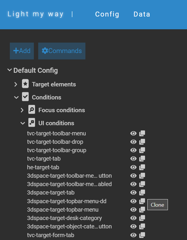
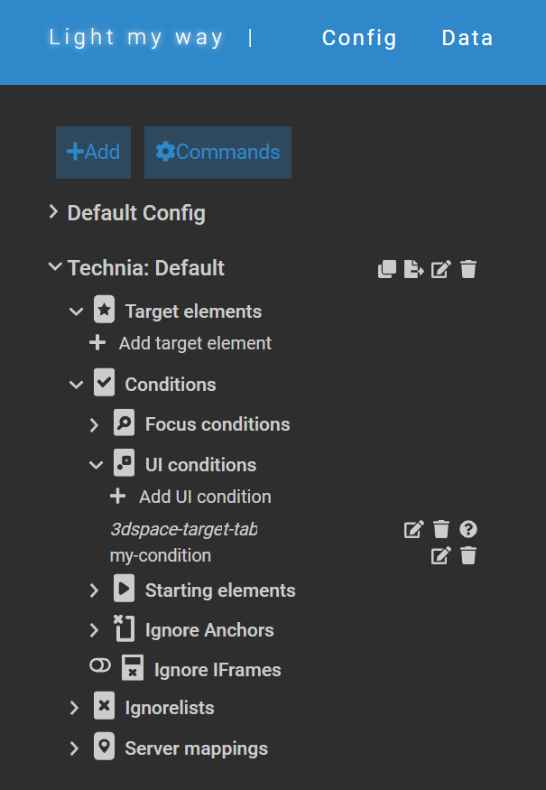
Light My Way comes with a rich set of built-in and supported configurations for target platforms. If for some reason like to override behavior of a built-in configuration it is possible to clone it into your target configuration.
Cloned definitions will be styled italic in the admin UI.
| Note |
|---|
By cloning a configuration you will take over that definition and will not benefit of potential updates to the built-in definition. |


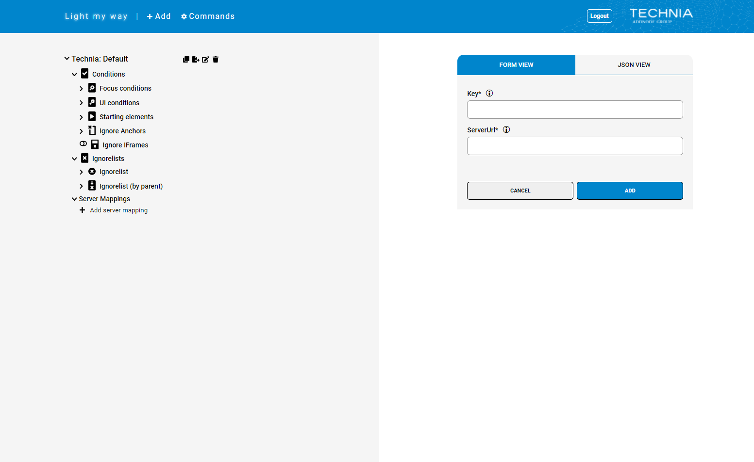
Server Mappings
Server mappings are used to match each repository with a number of environment URL’s. This to allow web extensions to automatically connect with the correct repository. Server mappings can be added from the Global Admin UI upon request.
Fields
Key | Any unique part of the target environment URL that should be mapped with the data service target. Be as specific as possible to avoid accidental forwards from domains that shouldn't be covered. E.g. |
Target | The repository to map to. E.g. |
| Note |
|---|
Be as specific as possible with the key definition to avoid accidental forwards from domains that shouldn't be covered. E.g. you might have a user help at ‘wiki/3dspace’ that you don't like to include so ‘3dspace’ alone is not a good key. |

Repository
Repositories are commonly used for separating guides and/or config based on state. E.g. one repository could contain “released“ guides for use in production and one could contain guides that are “in progress“ or not completed yet, before they are moved to the production repo to be used by the consumers. (companyName/prod & companyName/dev).
Switch between repositories from extension is done in extension settings.


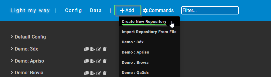
Create
Create a new repository by clicking the toolbar “+ Add” command, then selecting “Create New Repository“.

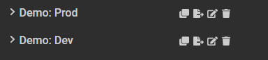
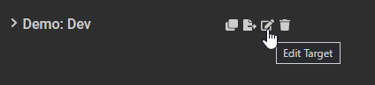
Edit
Edit a repository by clicking the edit icon next to the repository name.

Password
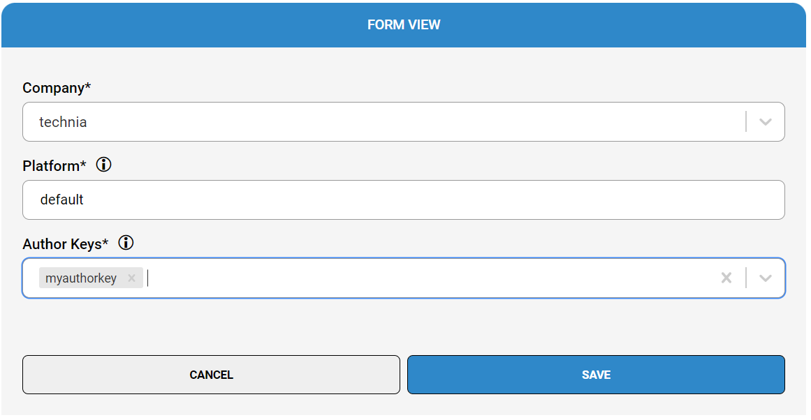
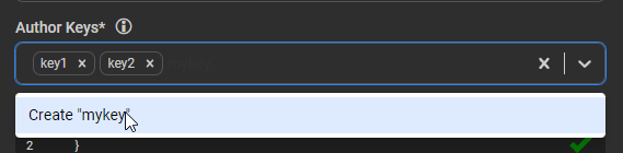
The author keys prompted to authors are controlled in the Admin UI. To modify, add or remove author keys click the edit icon next to the repository. Create a new key by typing the key value in the input field and then click the dropdown entry called Create “keyvalue“.


Settings
Example:
| Code Block | ||
|---|---|---|
| ||
{
  evaluateToggledGuidesOnly: false,
  delays: {
    mutationCallback: 250,
    mutationListener: 100,
    scrollListener: 100,
    inputListener: 250
  }
} |
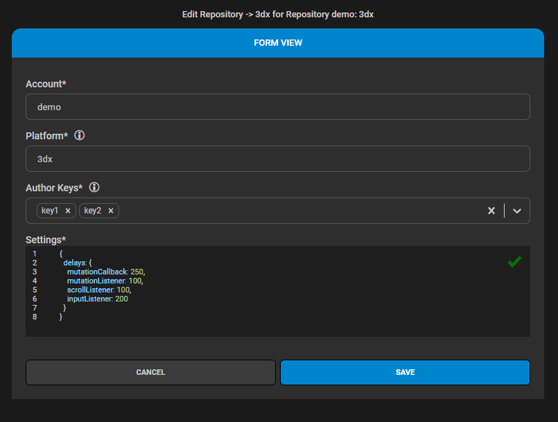

Setting (key) | Description | Type | Default |
|---|---|---|---|
| Used to tune debounce for performance based on your env specifics. A low debounce gives a quick response to the user but a higher performance footprint as evaluation happens more often. All evaluation debounce is controlled inside |
| |
| Input fields. e.g. debounce when typing text |
|
|
| The time between evaluation |
|
|
| How often html DOM updates is communicated (per document / iframe) |
|
|
| When scrolling how long to wait until reposition |
|
|
| Depending on your authors recording methodology you might consider a different evaluation strategy. In case you want to record guides in the context it belong only and use the available now feature you will go by the default and evaluate all by context. In case you want to guide users from anywhere to everywhere the available now feature makes no sense but the extra evaluation would only drive load and you should evaluate toggled guides only. |
|
|
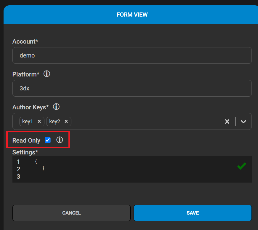
Read Only
If “Read Only” is checked the repository wont be editable by the Authors.
| Info |
|---|
Use this on repositories that are used in production to protect it from being accidentally edited or changed. |

Data management
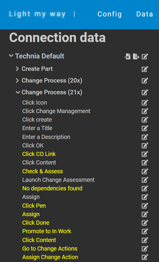
Administrators can view and edit all guide and instruction data from within the Admin UI. Accessing data could be useful in collaboration with Authors, troubleshooting etc. The Data view is accessed from the Data tab found in the top bar.
Data entries using xpath is indicated with yellow.

Import & export
To allow managing configuration and data in SCM tools or to bulk change efficiently using IDE features, it is still possible to edit the configurations JSON data as in previous releases. To do this
export the database content to the json format
change the files manually
delete the database
import the json data into a new database

Configuration export
Configurations could be exported from targets. Export could be useful to back up configurations, bulk modifications or storing it in SCM.

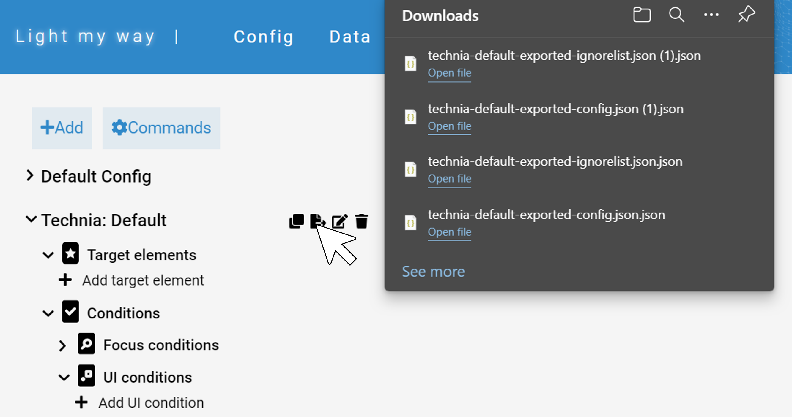
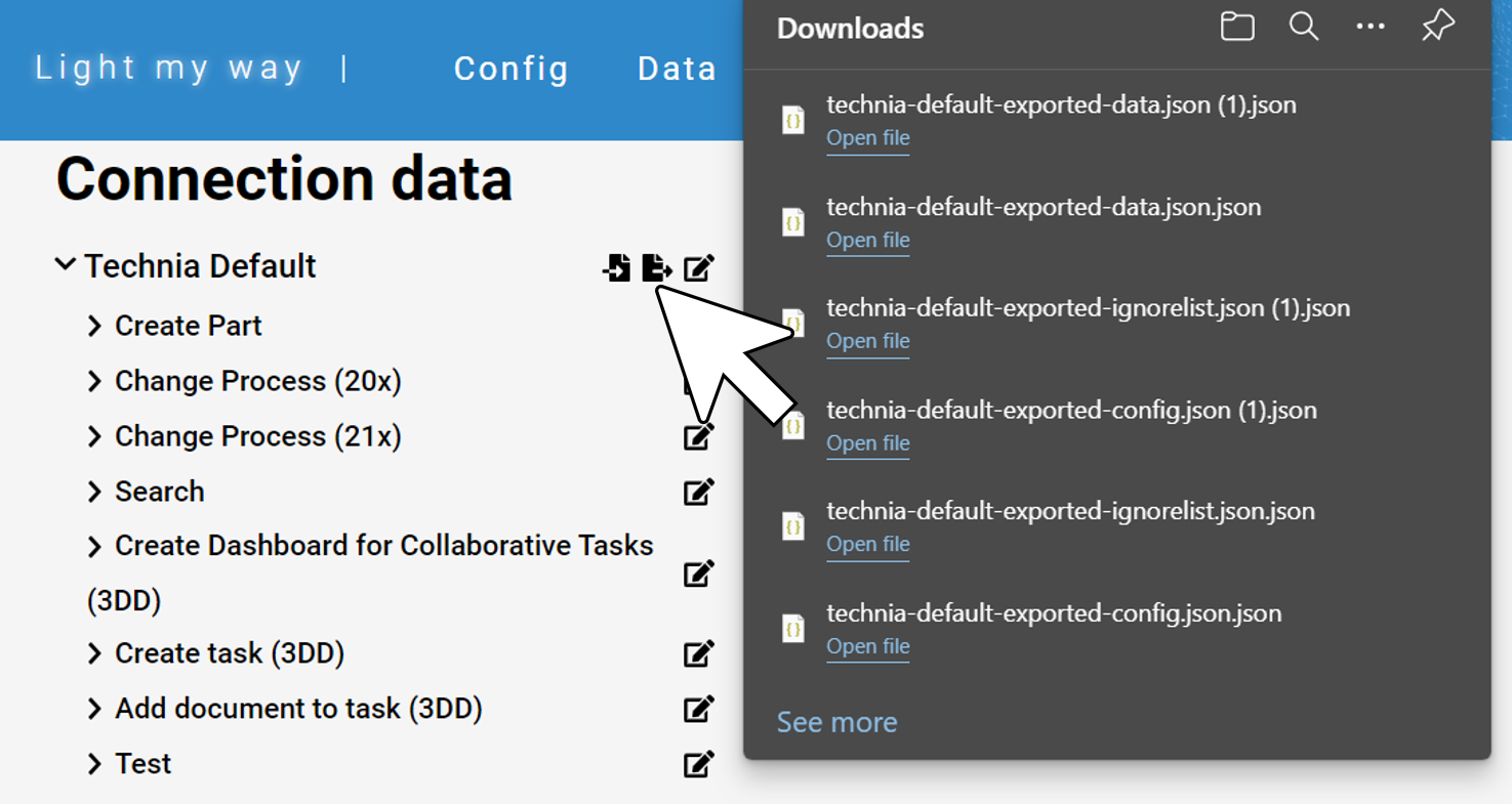
Data import / export
Data can be exported and imported from and to targets. This could be useful when moving data from one target to another or if there is a need to bulk modify data in an editor etc. The data export and import commands are available under the ‘Data’ tab found in the top bar.
| Note |
|---|
Importing data including numerical id will override existing and importing without would add new recordings. Numerical id is included with the export format by default. Importing data condition context reference have to match. Changes to the data could potentially cause problems with the condition context mapping. |

Licenses
| Include Page | ||||
|---|---|---|---|---|
|
Update log
| Include Page | ||||
|---|---|---|---|---|
|